CASE STUDY


Boutique-stay brand & landing page
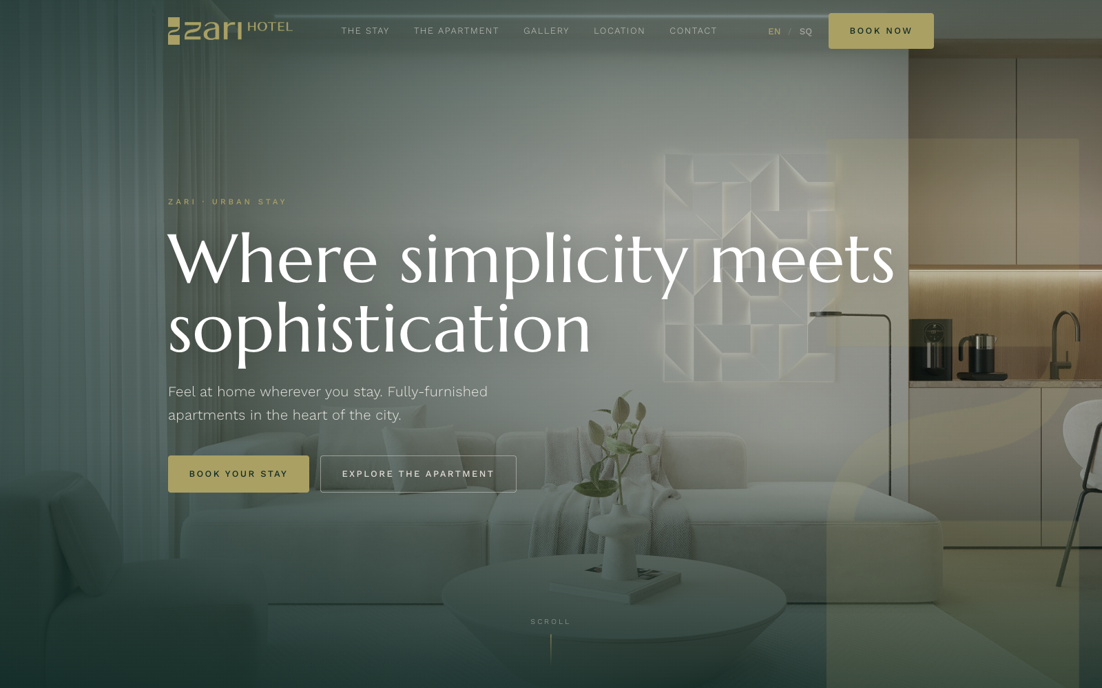
A pre-launch marketing site for a boutique serviced-apartment brand in Prishtina — a hand-built, bilingual landing page translating a real brand book into a calm, hotel-quality first impression, with the real photography, motion language and gallery already in place ahead of opening day.
- Platform
- Web
- Shipped
- 2026
From brand book to browser.
We ran the build through okton's eight stages — the same arc behind every project.
- 01
Think
The founder needed a launch-ready marketing site before the physical space and every operational detail were finalized — a brand-accurate landing page that could go out immediately, then absorb real photos, address and booking links as they arrive.
- 02
Frame
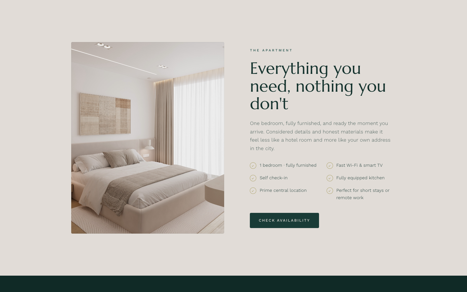
One long-scrolling page held together by in-page navigation — hero, the stay, the apartment, gallery, location, reserve — each section doing one job, with no separate pages or backend to maintain before launch.
- 03
Spec
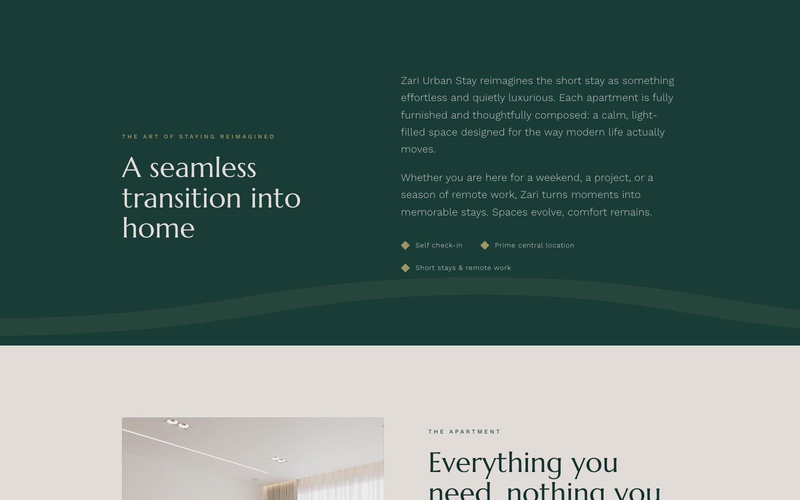
Every color and spacing rule was pulled directly from the real brand book rather than approximated — the exact deep green, brass gold and warm cream, with licensed-font stand-ins chosen to match the display and body faces until the real fonts are licensed.
- 04
Design
A restrained, hotel-quality visual language: full-bleed interior photography, a signature gold swoosh line-draw, diamond bullet marks and generous whitespace — built to feel like an established hospitality brand from the very first section.
- 05
Build
Hand-written HTML, CSS and vanilla JavaScript with zero dependencies — bilingual EN/SQ strings, scroll-reveal and parallax via IntersectionObserver, and a fully accessible gallery lightbox, all in a page that opens from a single file with no build step.
- 06
Test
Every motion effect — parallax, scroll-reveal, the swoosh draw-in, animated counters — checks prefers-reduced-motion before it runs, and the gallery lightbox was verified for full keyboard and focus support.
- 07
Ship
A static site with no server, database or build pipeline to deploy — ready to drop onto any host or CDN as-is, and just as easy to open directly from disk for a client review.
- 08
Grow
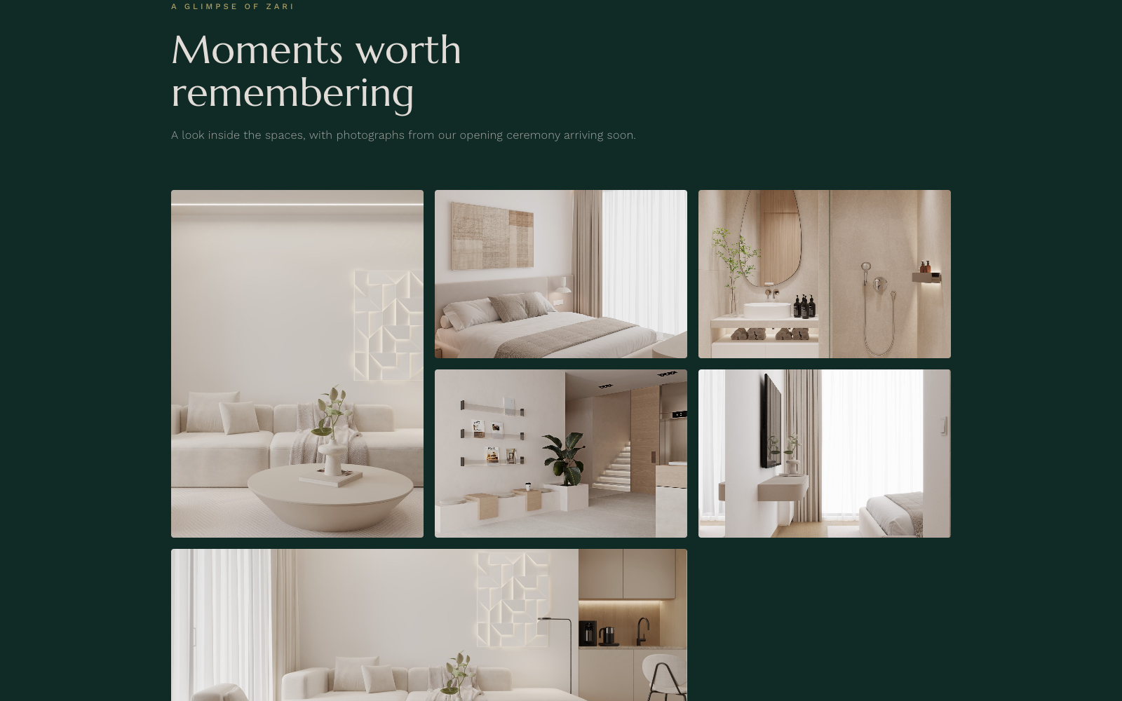
The gallery is already wired to receive the real opening-ceremony photography the moment it's ready, and the booking buttons, address and phone number are placeholders by design — built to be swapped for the live details without touching any layout or code.
What it gets right.
A brand book, translated exactly
Deep green, brass gold and warm cream — the precise palette from Zari's brand book — carry every section, with a serif display face reserved for headlines and a plain sans for everything else.
Motion that never demands attention
A signature gold line draws itself in on scroll, a watermark drifts with a subtle parallax, and every section fades and rises into view — all of it disabled the instant a visitor's system asks for reduced motion.
Bilingual from the first line of code
Every string on the page exists in English and Albanian behind a single toggle, persisted across visits — built directly into the markup, with no translation framework required.
No build step, no dependencies
The entire site is plain HTML, CSS and JavaScript — no framework, no bundler, no install step. It opens from a single file and works fully offline, fonts included.
A gallery that behaves like an app
Photos open into a full-screen viewer with keyboard arrow navigation, focus trapped correctly, and focus returned to the exact thumbnail you opened — details most static sites skip.
Accessible by default, not by afterthought
A skip-to-content link, visible focus rings, semantic landmarks and reduced-motion support are built in from the start — not patched on after a design review.
Stack
- Vanilla HTML/CSS/JS
- Zero build step
- Custom EN/SQ i18n
- Scroll-reveal + parallax
- Self-hosted fonts
- Offline-capable
Inside the page.
The real sections of the live preview site.
Want a launch-ready site like this for your business?
We build calm, brand-accurate sites and the small technical details — motion, accessibility, bilingual support — that make them feel considered. Tell us what you're building.